
Why Your Website Design Matters
In the digital age, your Website revamp tips is often the first interaction potential customers have with your brand. It’s crucial to make a positive first impression to capture their interest and trust. A well-designed website not only looks appealing but also conveys professionalism and credibility. Research shows that users form an opinion about a website within seconds, emphasizing the importance of an eye-catching and intuitive design. Whether you’re a small business or a large corporation, the design of your website can significantly impact your online success.
When visitors land on your website, they should immediately understand your brand’s identity, values, and offerings. A cluttered and outdated design can confuse users, leading to high bounce rates and lost opportunities. On the other hand, a clean and modern web design provides a seamless user experience, guiding visitors through your content effortlessly. By investing in an appealing website design, you not only attract more visitors but also keep them engaged and interested in what you have to offer.
Furthermore, an aesthetically pleasing website design can enhance brand recall and recognition. Consistent branding elements, color schemes, and typography create a cohesive visual identity that sticks in the minds of your audience. When users have a positive experience navigating your website, they are more likely to remember your brand and return for future interactions. Kmarks Web & Computer Solutions your website is a powerful tool for building brand loyalty and establishing a strong online presence in a competitive market.
Identifying Clutter in Your Current Website
Before embarking on a website revamp journey, it’s essential to identify areas of clutter in your current design. Clutter can manifest in various forms, such as excessive text, crowded layouts, distracting elements, and outdated graphics. Take a critical look at your website and consider whether each element serves a purpose in enhancing user experience. Are there unnecessary buttons, flashy animations, or complex navigation menus that hinder usability? By pinpointing cluttered areas, you can prioritize decluttering efforts and focus on creating a cleaner and more streamlined design.
One common sign of clutter is a lack of white space in your design. White space, or negative space, plays a crucial role in improving readability and visual hierarchy on a webpage. When elements are too close together, the design can feel overwhelming and chaotic. By incorporating ample white space around content blocks, images, and CTA buttons, you create breathing room for the eyes and guide users’ attention to key information. A clutter-free design with well-balanced white space exudes sophistication and clarity, drawing users into your content with ease Website revamp tips.
Moreover, outdated content and functionalities can contribute to a cluttered website appearance. If your site still features flash animations, bulky sidebars, or complex forms, it may be time for a refresh. Users expect modern web experiences that are fast, intuitive, and visually appealing. By removing outdated elements and embracing clean web design trends, you demonstrate your commitment to staying relevant and user-focused. A clutter-free website signals to visitors that you value their time and attention, encouraging them to explore further.
Additionally, excessive use of colors, fonts, and design styles can create a cluttered and inconsistent look across your website. Inconsistency in branding elements can confuse users and dilute your brand’s messaging. Simplify your color palette, stick to a few complementary fonts, and maintain a cohesive design style throughout your site. A harmonious visual presentation not only enhances brand recognition but also creates a harmonious browsing experience for visitors. By decluttering your design elements and embracing a consistent aesthetic, you pave the way for a more impactful and memorable Website revamp tips presence.
The Art of Simplicity in Web Design
When it comes to web design, simplicity is key to creating a memorable and effective online presence. A clean and minimalist design not only looks modern and stylish but also improves user engagement and conversion rates. By stripping away unnecessary elements and focusing on essential content, you create a visual hierarchy that guides users through your website with clarity and purpose. Simple design choices, such as ample white space, limited color palette, and intuitive navigation, enhance user experience and make information easily accessible.
One of the essential aspects of simplicity in web design is decluttering your layouts and content. Avoid cramming too much information on a single page and opt for concise and relevant content that conveys your message effectively. By organizing content into digestible sections and using visual cues like headings, bullet points, and images, you help users scan and absorb information quickly. A clutter-free layout reduces cognitive load on visitors, allowing them to focus on the most critical aspects of your website without feeling overwhelmed.
Furthermore, simplicity in web design extends to the functionality and interaction elements of your website. Intuitive navigation menus, clear call-to-action buttons, and straightforward forms streamline the user journey and encourage desired actions. By minimizing user effort and providing a seamless browsing experience, you increase the chances of conversions and engagement. Simplify complex processes, eliminate unnecessary steps, and optimize user interactions to create a website that is both user-friendly and high-performing.
Colors, Fonts, and Whitespace: Crafting a Clean Aesthetic
The choice of colors, fonts, and whitespace in your web design plays a significant role in shaping the overall aesthetic and user experience. Colors evoke emotions, communicate brand identity, and guide user interactions on a subconscious level. By selecting a cohesive color palette that aligns with your brand values and target audience preferences, you create a harmonious visual journey for visitors. Consistency in color usage across various elements like buttons, links, and backgrounds enhances recognition and reinforces brand association.
Similarly, fonts are more than just text styles – they are integral design elements that contribute to readability, hierarchy, and brand personality. Choose fonts that reflect your brand’s tone and style while ensuring readability across different devices and screen sizes. Establish a hierarchy of font sizes and styles to emphasize important content and guide users’ reading flow. By utilizing typography effectively, you enhance the overall readability and visual appeal of your website while maintaining a clean and cohesive design aesthetic.
Whitespace, often referred to as negative space, is a powerful design element that can make or break the aesthetic appeal of your website. Adequate whitespace around content blocks, images, and other elements creates visual breathing room and improves content legibility. Embracing whitespace in your design allows important elements to stand out, reduces visual clutter, and enhances overall user experience. By leveraging whitespace effectively, you create a sense of balance and sophistication that elevates the visual impact of your website.
Optimizing Navigation for a Seamless User Experience
Navigation is a cornerstone of user experience design, influencing how visitors explore and interact with your website. A well-structured navigation system guides users to relevant content, services, and products efficiently, reducing bounce rates and encouraging engagement. Simplify your website’s navigation menu by organizing categories logically, using descriptive labels, and implementing intuitive drop-down menus where necessary. Clear and accessible navigation enhances user satisfaction and helps them find what they’re looking for quickly and easily.
Consider implementing breadcrumbs, search bars, and clickable buttons strategically to improve user orientation and navigation flow. Breadcrumbs provide users with a trail of their browsing path, making it easy to backtrack or explore related content. A search bar empowers users to find specific information quickly, especially on content-heavy websites. Well-designed clickable buttons for primary actions like ‘Contact Us’ or ‘Buy Now’ draw attention and drive conversions. By optimizing navigation elements, you create a seamless and intuitive browsing experience that keeps users engaged and satisfied.
Responsive design is essential for ensuring a consistent and user-friendly experience across different devices and screen sizes. With the increasing use of smartphones and tablets for browsing, your website must adapt seamlessly to various resolutions and orientations. Implement responsive navigation patterns that adjust to different screen sizes, prioritize essential content, and maintain usability on mobile devices. By optimizing navigation for mobile responsiveness, you provide a cohesive user experience that caters to the preferences and behaviors of modern digital consumers.
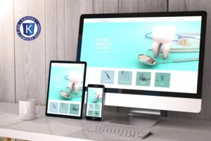
Mobile Responsiveness: Extending Clean Design Across Devices
In today’s mobile-centric world, having a mobile-responsive website is no longer a luxury but a necessity. Mobile traffic accounts for a significant portion of web traffic, and users expect a seamless experience across all their devices. A clean and intuitive design that adapts to different screen sizes and resolutions is essential for engaging mobile users and driving conversions. By implementing responsive design principles, such as flexible grids, scalable images, and touch-friendly elements, you can ensure that your website looks and functions flawlessly on smartphones and tablets.
Optimizing your Website revamp tips for mobile responsiveness involves more than just resizing elements to fit smaller screens. It requires a thoughtful approach to user interactions, content prioritization, and performance optimization with Website revamp tips. Streamline your mobile layout by focusing on essential content, simplifying navigation menus, and minimizing user inputs. Ensure fast loading times and smooth transitions to provide a seamless browsing experience on mobile devices. A mobile-responsive design not only improves user satisfaction but also boosts your site’s visibility and rankings in search engine results.
By extending your clean web design principles to mobile devices, you create a consistent and cohesive brand experience for users across all platforms. Consistent branding elements, intuitive navigation, and visually appealing layouts enhance user engagement and build trust with mobile visitors. Pay attention to touch gestures, thumb-friendly buttons, and clear CTAs to facilitate effortless interactions on smaller screens. Whether users access your site on a desktop, laptop, or smartphone, a mobile-responsive design ensures that they have a seamless and enjoyable browsing experience, maximizing your impact and conversions.
Phone: (334) 472-0686, Support: (334) 472-0686 Ext 5
Email: support@kmarks-solutions.com


